Redesigning Zhihu Profile for Millions
Background
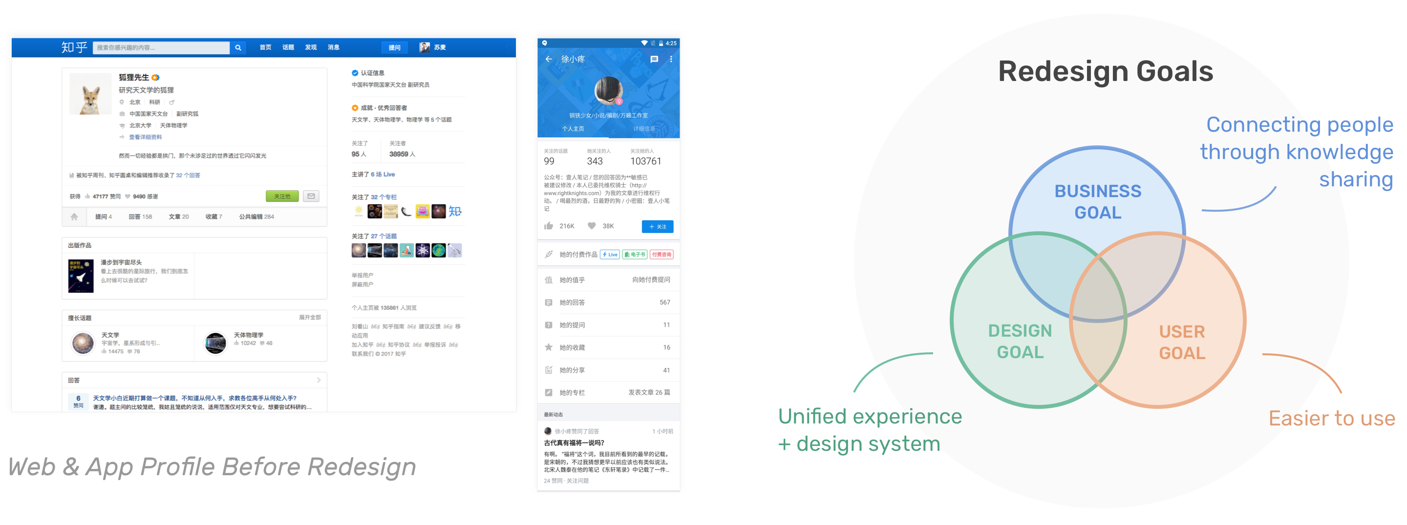
Zhihu is a Chinese question-and-answer platform (like Quora). It was launched in 2011 and now has over 200 million users. In 2016, we found the experience of the website was challenged due to the hyper-growth of the business. We had accumulated lots of design debt. We heard from users that they had difficulty using the product. It was also difficult for the team to know where to put new features because the interfaces didn’t have a clear information hierarchy. Thus we decided to redesign the experience of the web product, starting from user profile.
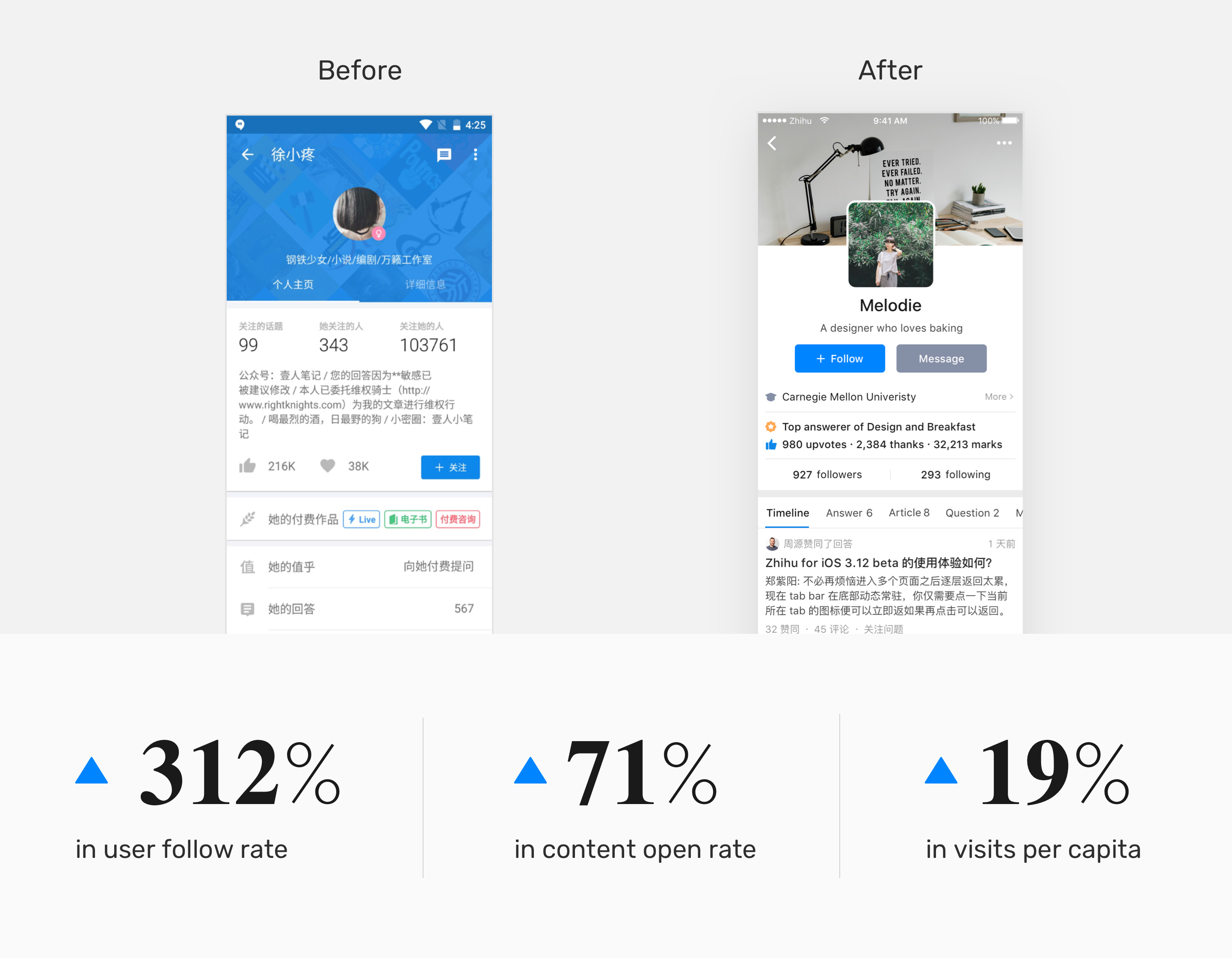
The web profile redesign launched in winter of 2016, and the app profile launched in summer of 2017. Both redesigns increased the user follow rate of Profile significantly.
My Role
- Redesigned the entire experience of Profile for web between Jul and Dec 2016.
- Collaborated with 3 other designers to work on the new web design system.
- Designed the entire experience of Profile for Android and iOS in 2017.
What’s the Purpose of User Profile?
Identifying Problems of the Existing Profile
Learning from People and Data
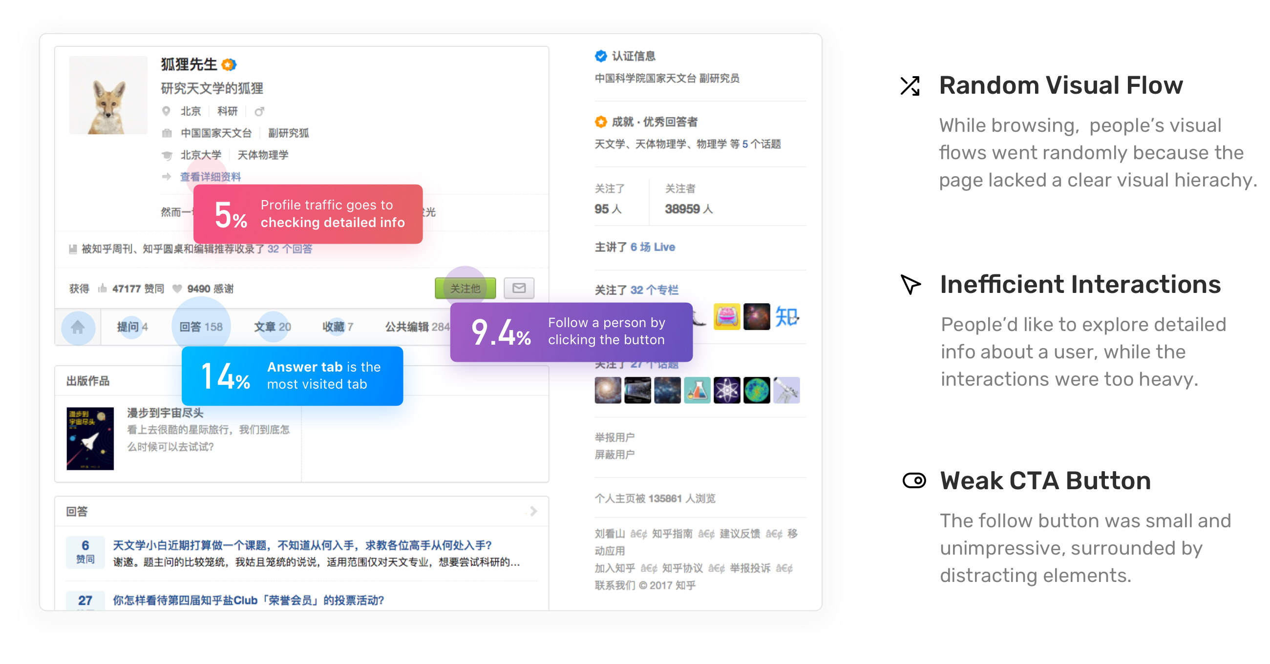
At the outset of the project, I talked to people from our product teams and operation teams to understand the problems from their perspectives. After that, I conducted usability testing with our internal users to learn more about what problems they had when using the Profile.
In the meantime, I leveraged Google Analytics to collect quantitative data. By doing this, I got a better understanding about how people were using Profile in general, which helped me see a bigger picture of the experience. When I combined results from usability testing and data, I found out the problems I should focus on for the redesign.
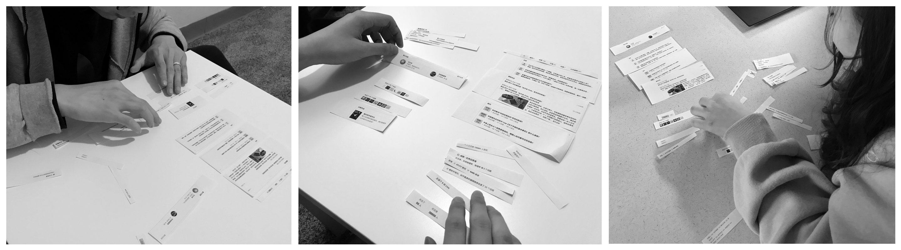
Evaluating the Information Structure
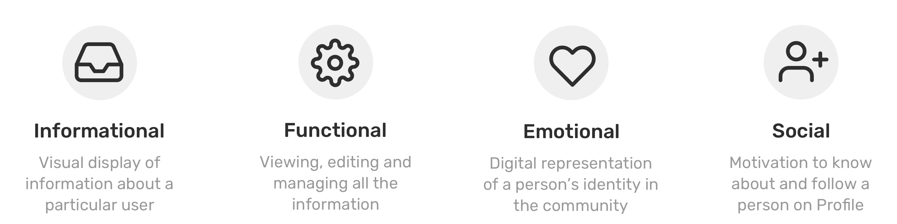
To learn how people understood the existing information, I organized card sorting sessions with 6 users. I invited them to group the existing information on Profile page, and then prioritize what information mattered to them most when they looked at another user’s profile.
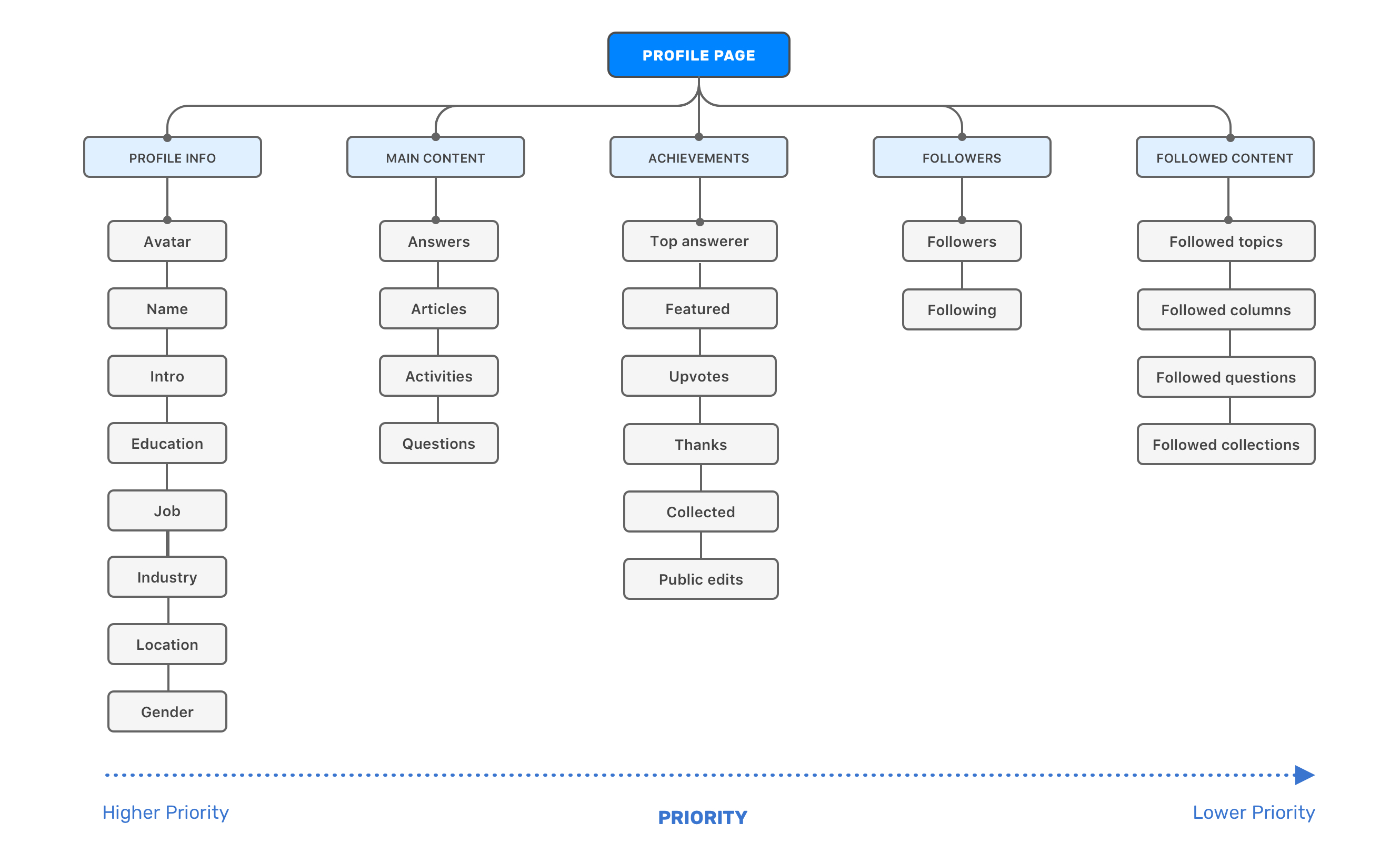
Then I developed a diagram to visualize what I learned from the card sorting. I learned what information users care about and why the existing design didn’t meet users’ expectations. The findings also helped me move forward to the exploration of our information structure.
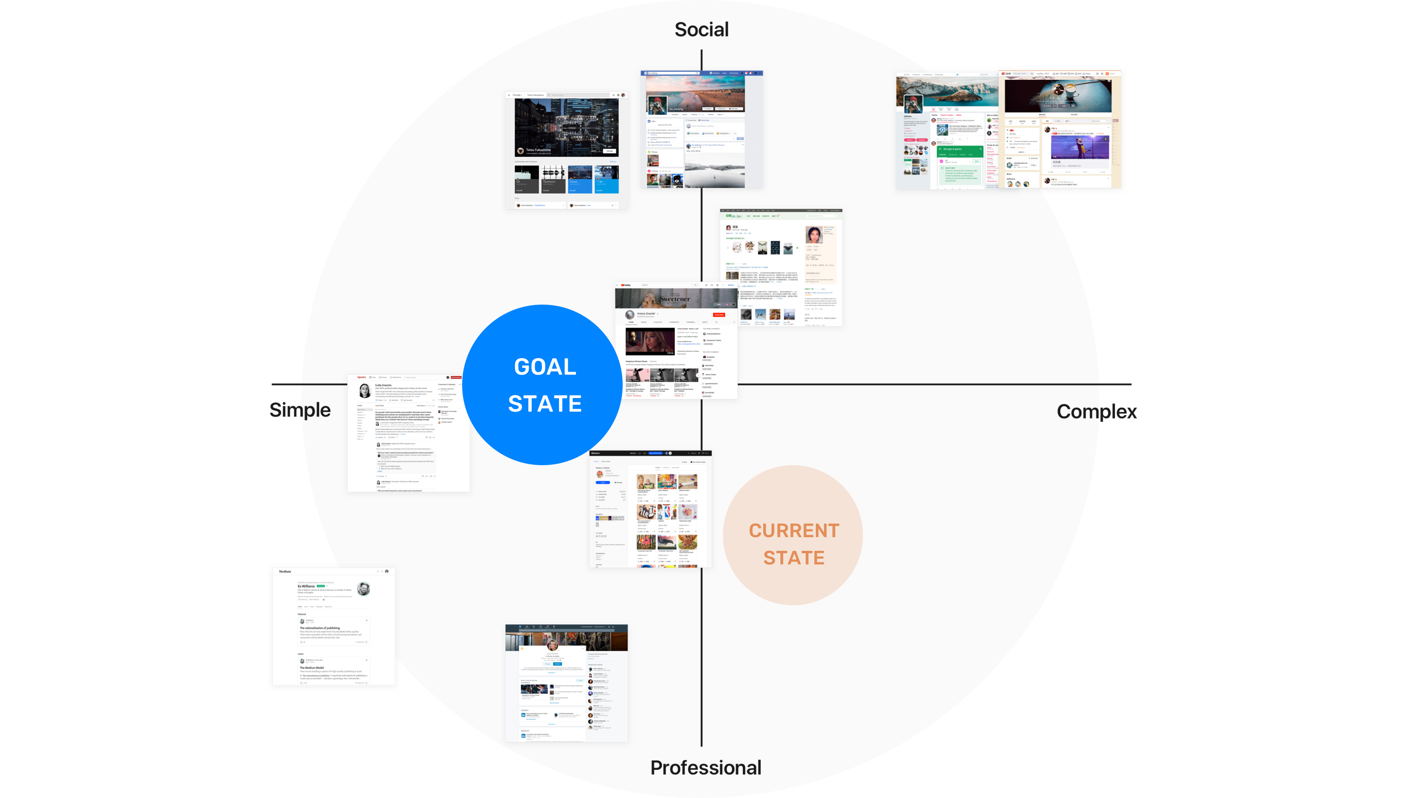
Finding the North Star
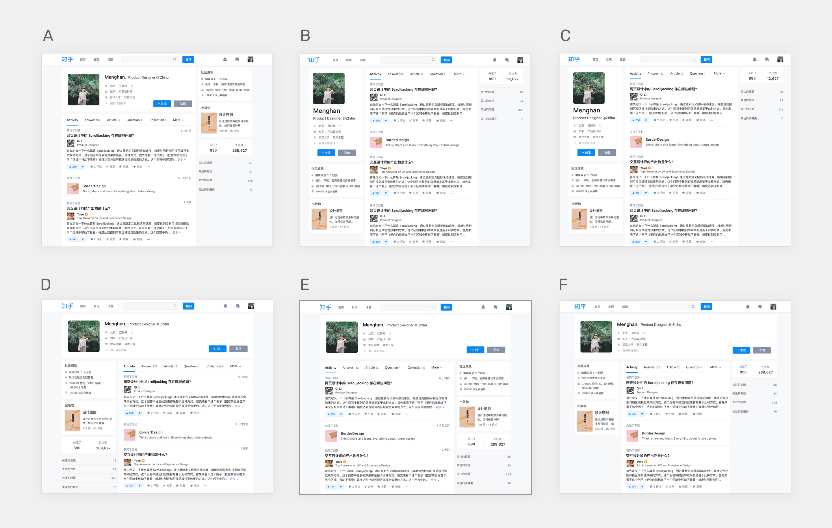
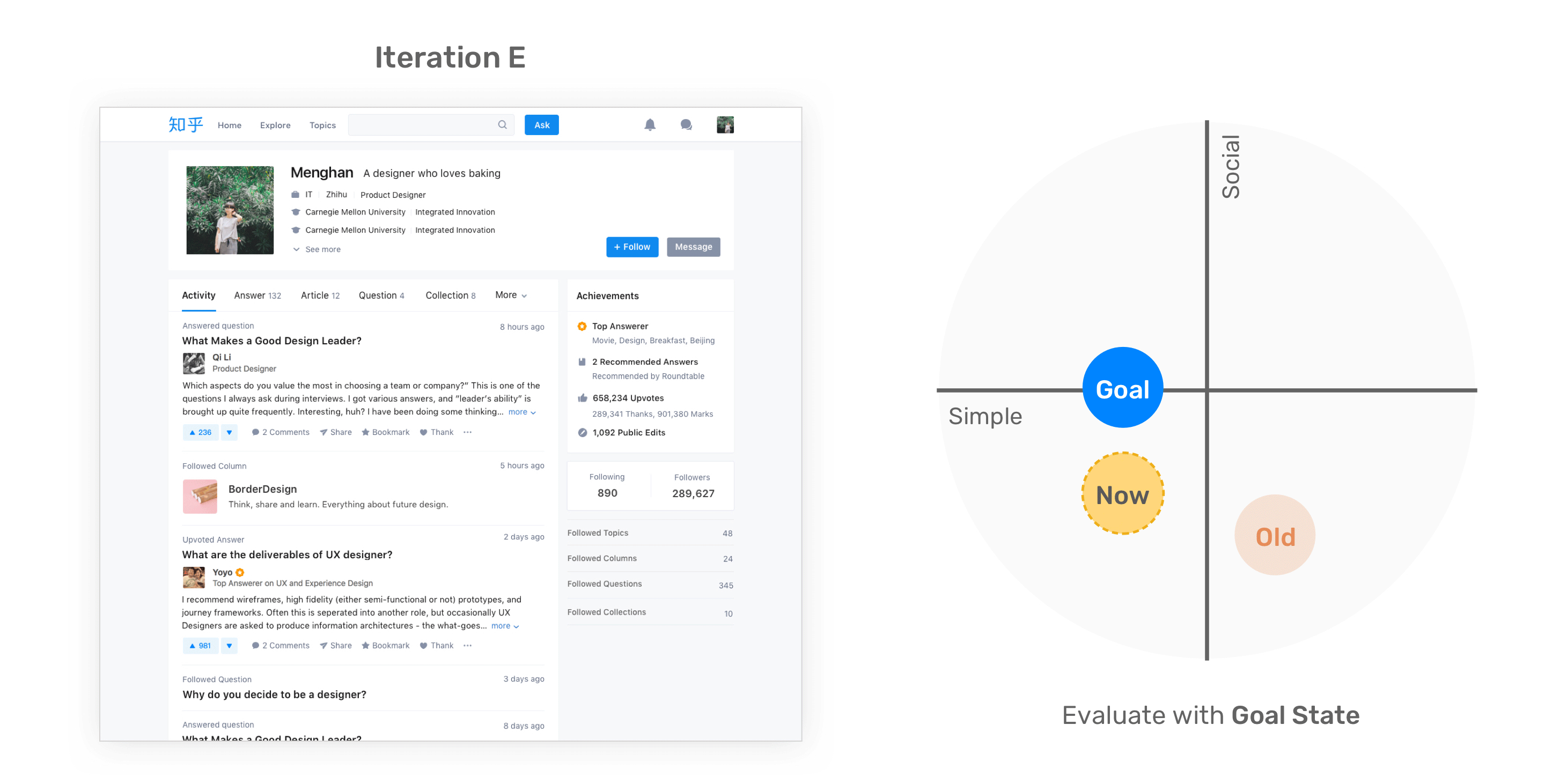
User profile is a common module for almost every social product, so in order to learn how other products approach their profiles, I did a competitive analysis and mapped the profiles to a 2x2 matrix. After discussing with the team, we found out our current state and goal state.
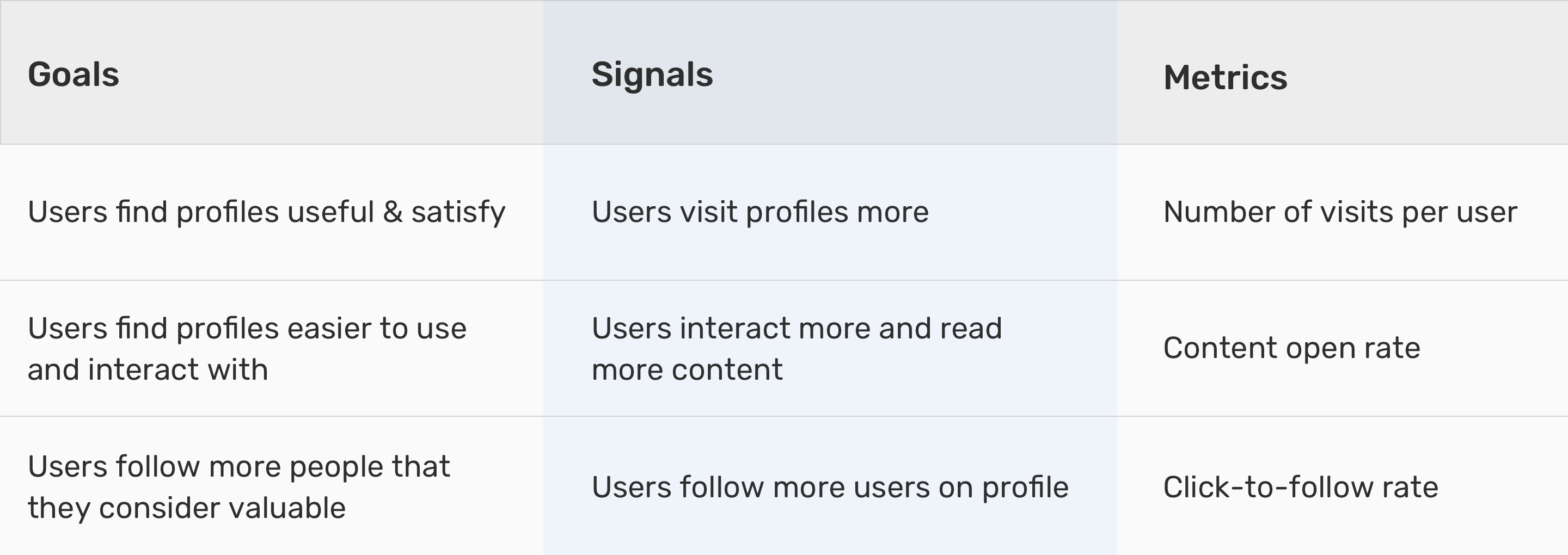
Defining Success Metrics
Iterative Design Process
Exploring Information Structure with Wireframes
Based on the results from card sorting, I divided the information on Profile to 5 main modules.
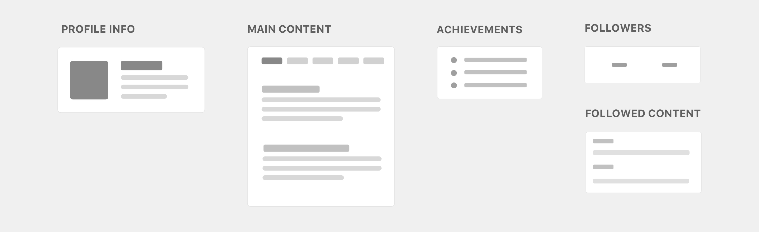
Then I organized these modules to explore possible layouts based on the priority of which modules mattered the most for people. Here I met a challenge: Every possibility seems like the potential solution, so how could we choose the right one to start with? I decided to involve our internal users into the discussion. I showed all the wireframes to them, and listened to what they thought about it.
From the conversations I found a valuable insight from people’s perception about the page: The profile info should be the head of the entire profile body. Also our team had an assumption that three-column structure might be more efficient for people to scan as much information as possible. According to the finding and assumption, I decided to move forward with the up-down & three-column structure layout.
First Prototype
With the decision from wireframe phase, I came up with the initial mid-fidelity prototype. My main design changes were:
- Changed the layout of the information structure from the left-right & two-column structure to the up-down & three-column structure.
- Curated all the information into 5 modules to increase browsing efficiency.
- Re-arranged the content tabs and made the most-visited tab (answers tab) the default tab.
- Simplified the interaction of checking detailed profile info.
- Reduced unnecessary elements to make CTA buttons stand out.
Getting Feedback
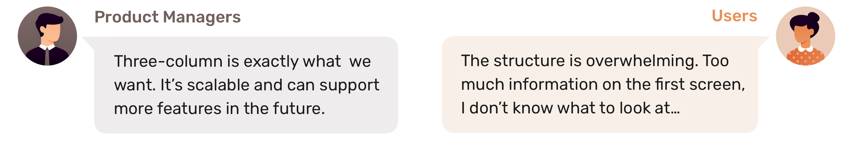
In order to test my design concept, I printed these prototypes and put them on the wall of the office where people could stop by and take a look. We created a Slack channel and received lots of feedback throughout the company. From the feedback I learned there were two major problems in my first attempt:
- The order of the content tabs didn’t match people’s mental model. (Easier to address)
- Conflicting feedback on three-column structure from PMs and users.
Iterations Based on Feedback
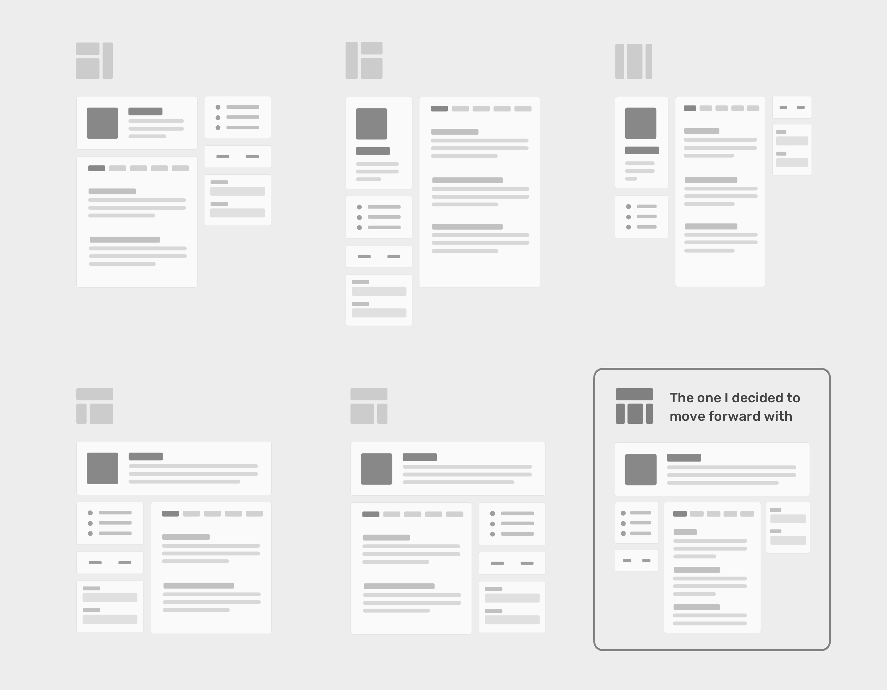
To address the conflict, I took a step back to check my assumptions in wireframe phase, and designed higher fidelity prototypes to help people get a more tangible feeling about each possibility.
After lots of discussion on the pros and cons of each layout, we all agreed that Iteration E struck a good balance between clarity and efficiency. Two-column structure created clearer visual priority and flow. It’s also more consistent with the layout of other pages.
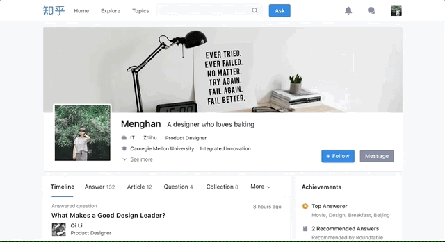
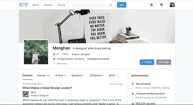
Making it More Social
However, when comparing the iteration with the goal state, I realized even if the new design solved most usability problems, it was still not social enough to encourage people to connect. To address it, I did a quick research on what elements were used by other products to emphasize social. I decided to apply cover photo and highlighted the potential connections between users.
Perfecting the Interaction
One of our goal was to make the experience more efficient. I made interactive prototypes to test my idea on the content navigation, which was the key to improve efficiency of browsing. Here are my iterations:
-
Iteration 1: The navigation tabs would stick to the top header when user scrolls the page. The problem was that two bars sticking on the top of page took up too much space thus it was not friendly for users with smaller viewpoint screens.
-
Iteration 2: How about we push the header out of the view when user scrolls down and bring it back when user scrolls up? However, by testing with prototype, I found that the movement felt bulky and disturbing.
-
Iteration 3: How about we combine the header and navigation tabs? Yes it worked! The final solution hit a balance between efficiency and volumn. The experience was more smooth and responsive.
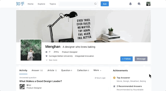
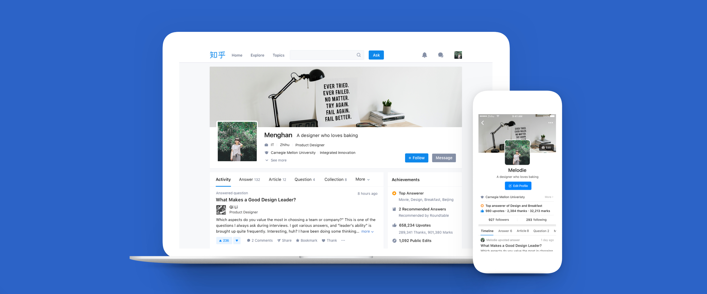
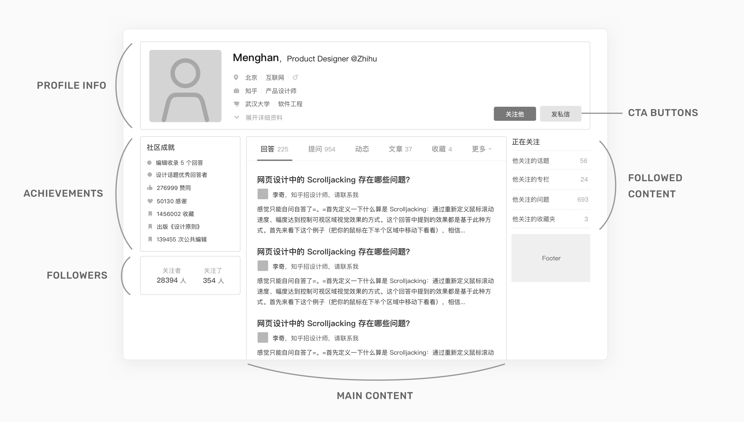
Web Profile Final Design
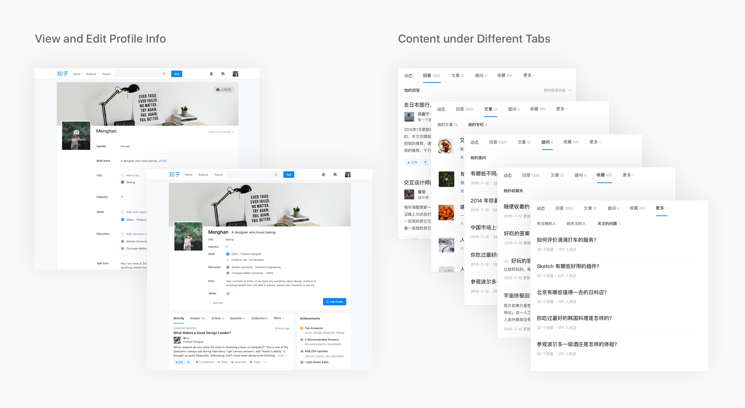
Apart from designing the main profile page, I also worked on sub-modules, including different content style under each tab and the experience of viewing and editing profile info. At the same time, I partnered with 3 designers to build up Zhihu Web 2.0 Design System. We kept evolving the style guides and components to guide the redesign of the other pages on web.

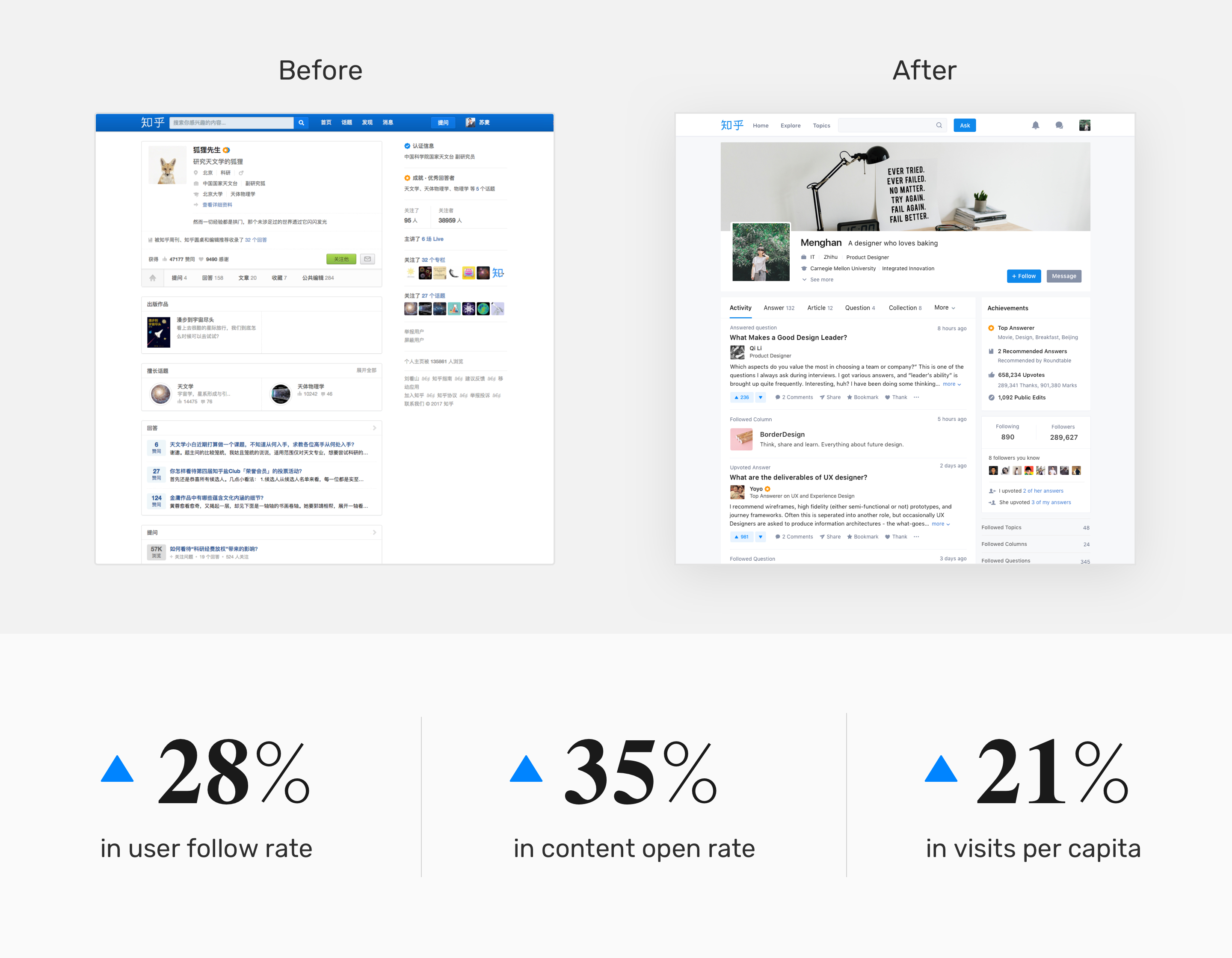
The Impact of Web Profile Redesign
After our 5 months’ design and development, we launched the redesigned web Profile to a small set of users in November 2016. During this time, we kept track of user feedback and made adjustments accordingly. After demonstrating the redesign didn’t have negative impact on metrics, we gradually rolled the redesign out to everyone.
Designing for Mobile App
When designing for mobile devices, the major challenge I was facing was how to adapt the information on web to mobile devices and create a consistent cross-platform experience at the same time. I sketched on paper and made hi-fi prototypes to test the design, and kept iterating until it meet our design goals.
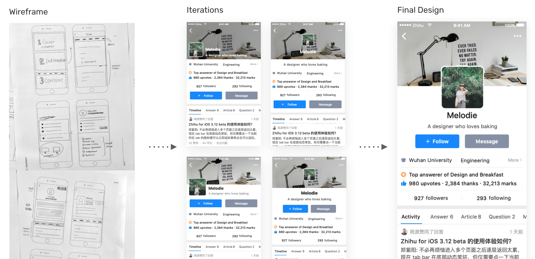
Mobile Profile Final Design
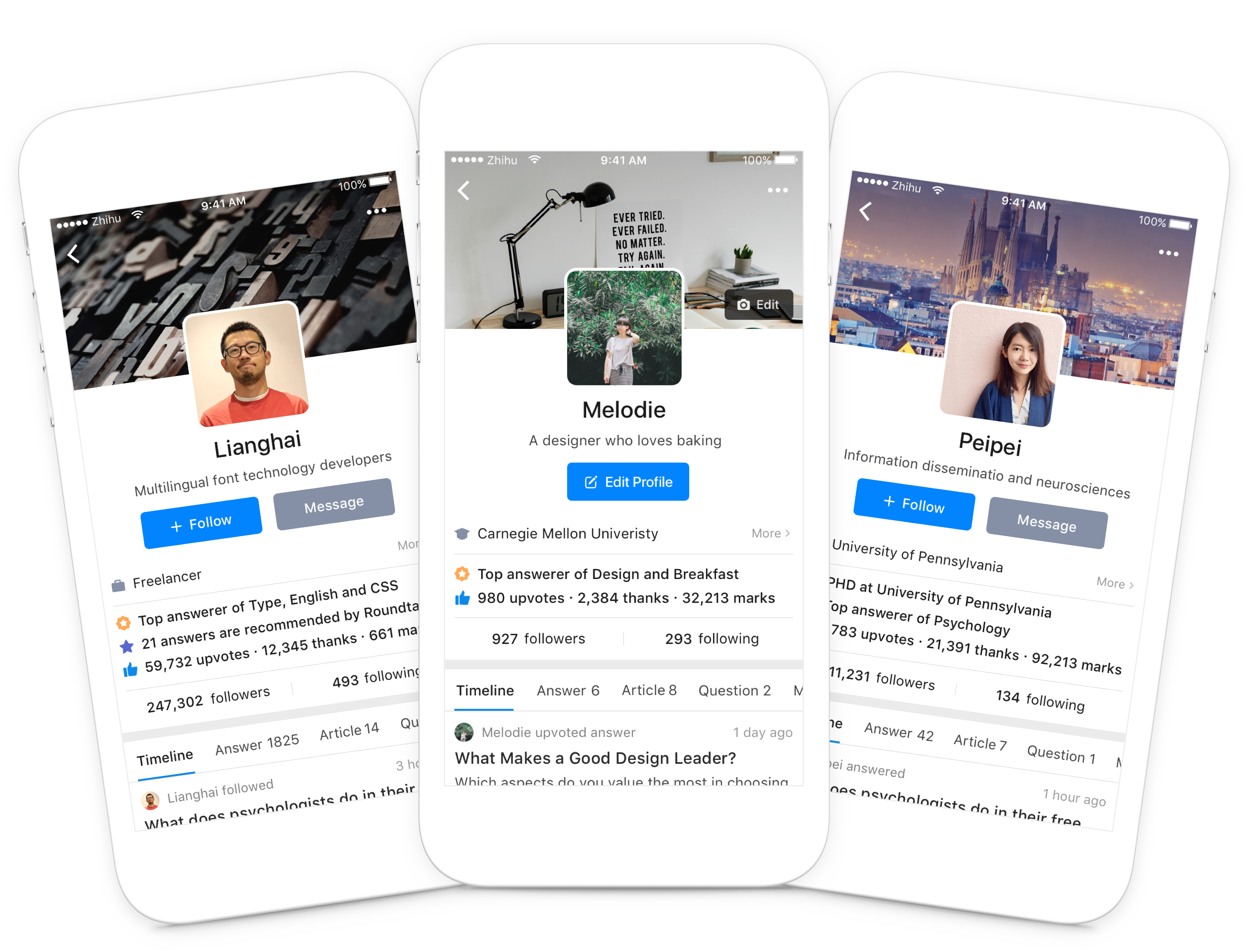
The Impact of App Profile Redesign
The redesign of Profile on Android was launched in Sep 2017, and the iOS version was launched in Feb 2018. For Android, here are the key results:
Reflection
Design is a never ending process. Along the way, I came across lots of frustrating moments when I couldn’t figure out how to take my design to the next level, yet after trial and error I pushed myself and finally found a better solution. Even launch is only a start, we were continuing to learn, iterate and improve upon it.
Also, I reflected on the entire project and thought about where I could do better:
- 🔍 Validate idea as early as possible with external users.
- 🕹 Use better opt-in strategy for web.
- 📐 Define more comprehensive measurements for the goals.