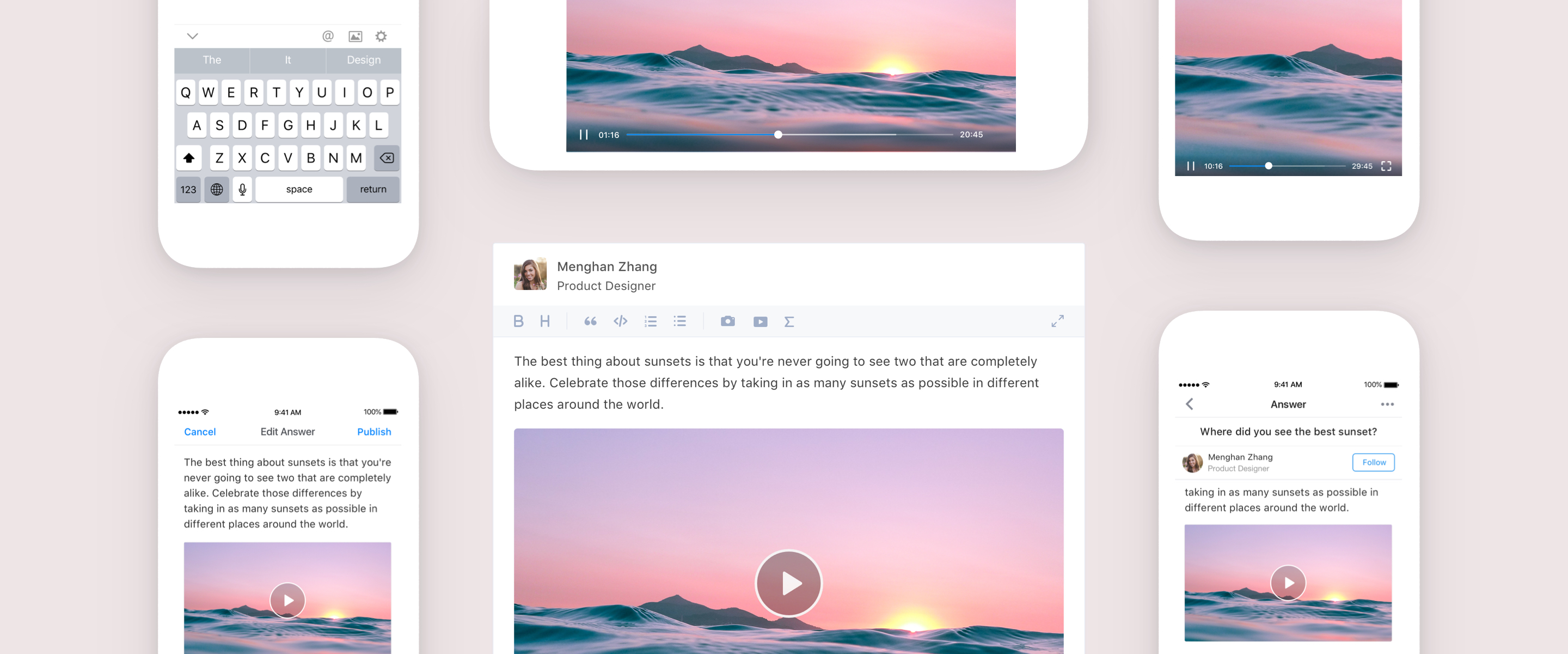
Designing Video Experience for Zhihu
Why Supporting Videos?
On Zhihu, people write answers to a large variety of questions. However, for questions like “How do you cook a perfect steak?” or “How do you improve your accent in speaking?“, written answers, even with images, are not sufficient and efficient enough to illustrate the idea. Therefore, in 2017, we decided to introduce a new form to the platform – Video.
My Role, and Challenges Behind the Scene
Video is such a obvious feature for many people, but it is more complicated than it looks like in terms of the logic and technical complexity. As the only designer on the agile team, I partnered with 2 PMs and 4 Engineers to build this feature. Some biggest challenges we met:
- Tight deadline: only 3 months to build it up and launch it
- Many technical constraints and much product complexity
The Scope
What will video on Zhihu look like? Together with our team, I mapped out the typical user journey of producing and consuming videos on social platforms, which includes four stages – Shooting, editing, uploading, and viewing. Through discussion, we decided to focus on the last two stages for the first version, to quickly test if the video concept works for the Zhihu community.
In this post, I will share the design process of three parts:
- Video consumption
- Video uploading
- Video feature onboarding
Part 1 • Video Consumption
How does “video” fit into the ecosystem of Zhihu? How is the experience of watching a video? What are different about Zhihu videos compared to videos of other products?
Research & Benchmarking
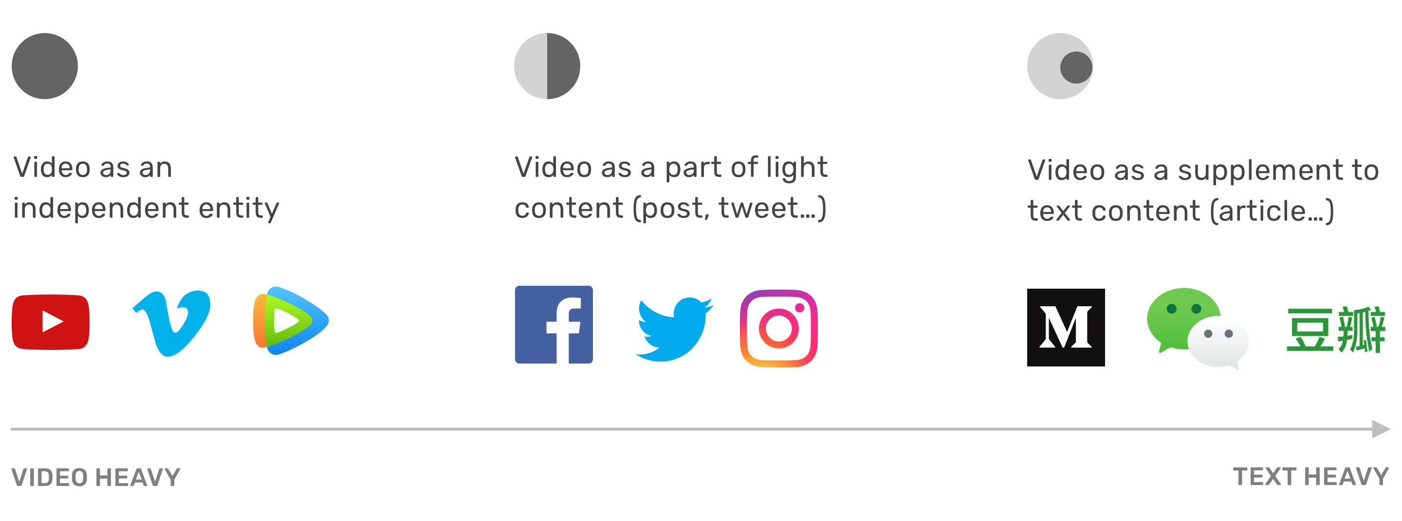
To learn about how other UGC platforms embed videos to their communities, we conducted completitive analysis. By benchmarked all these mature products, we figured out that “Video as an element of a bigger subject” was the most natural form for Zhihu’s existing ecosystem, since Zhihu has been a text-heavy platform, and we wanted to add video as supplement to text content to help the user illustrate ideas visually.
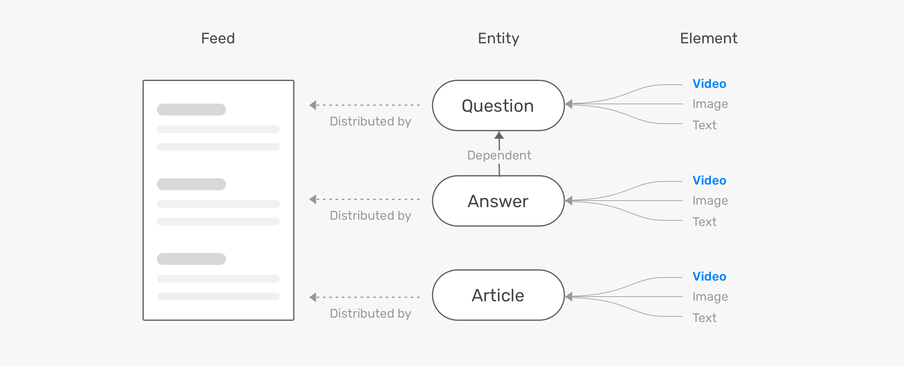
Then we dived deeper into the existing structure of Zhihu content, and I created the map below to visualize the concept of relationship if we introduce videos to this system.
Design Principles
- Consistent experience across platforms
- Cater to different scenarios (mobile/desktop)
- Simple and intuitive interactions for the video player
User Flows
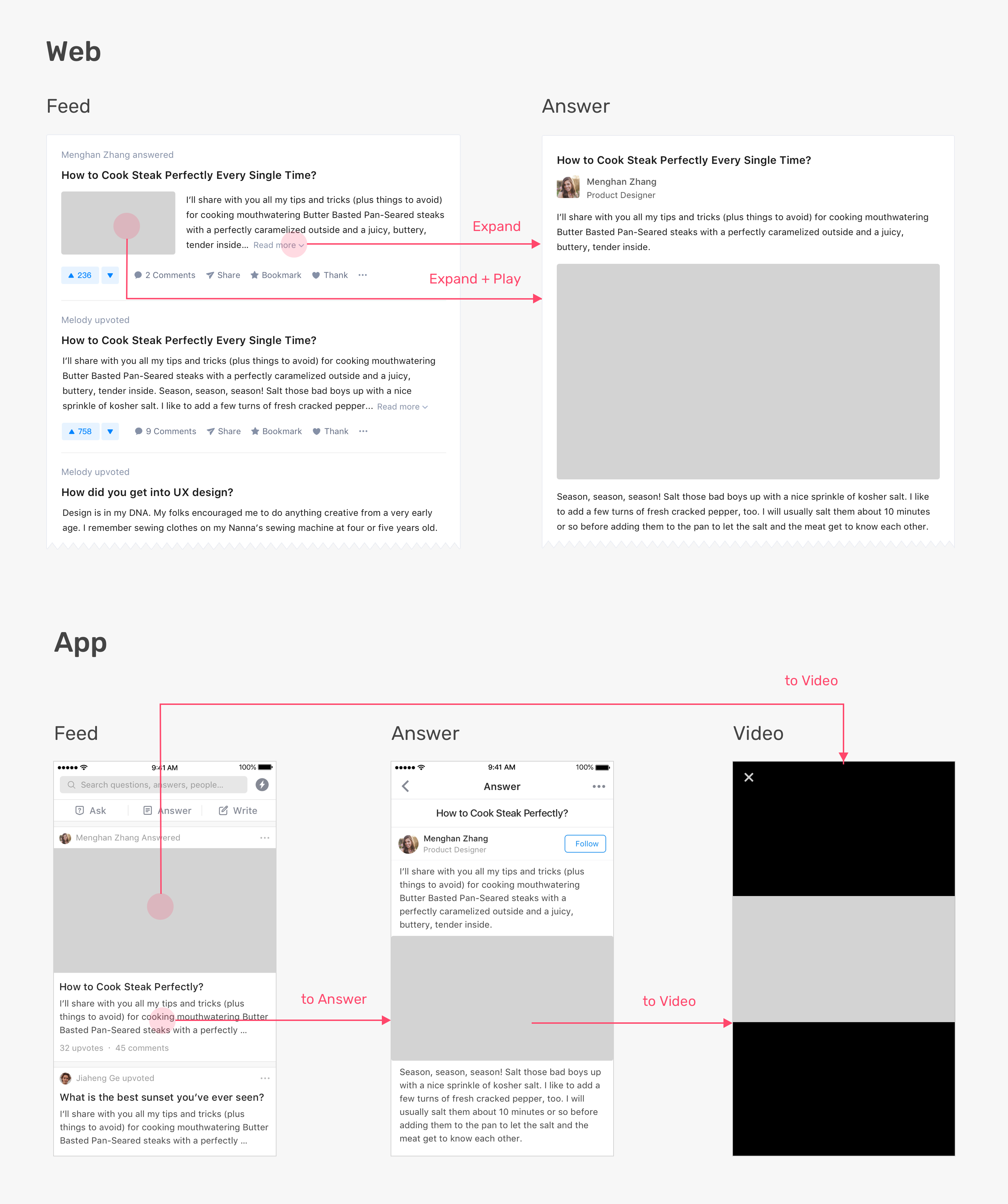
Video Player Design
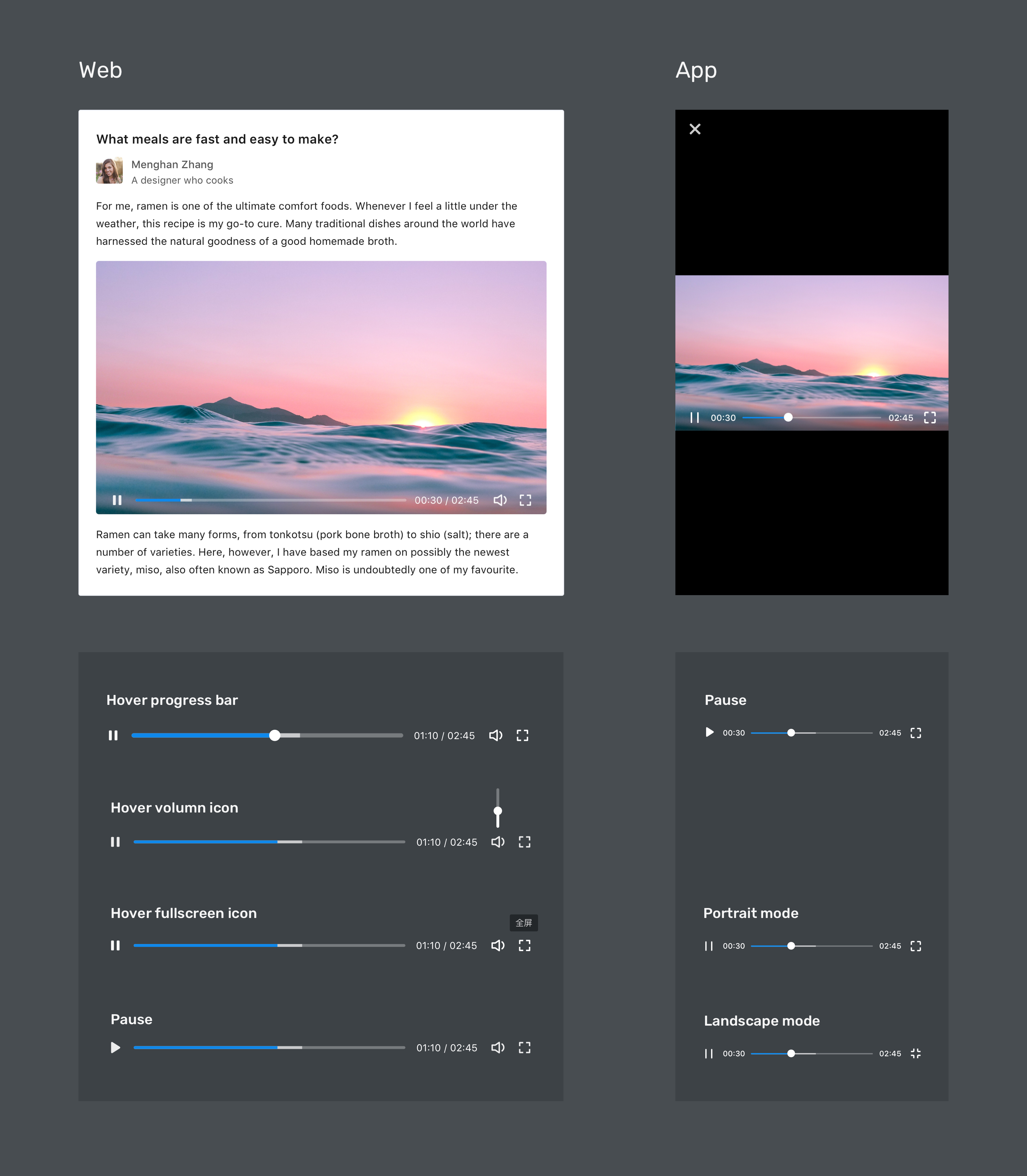
Video Consumption Experience
Web

App
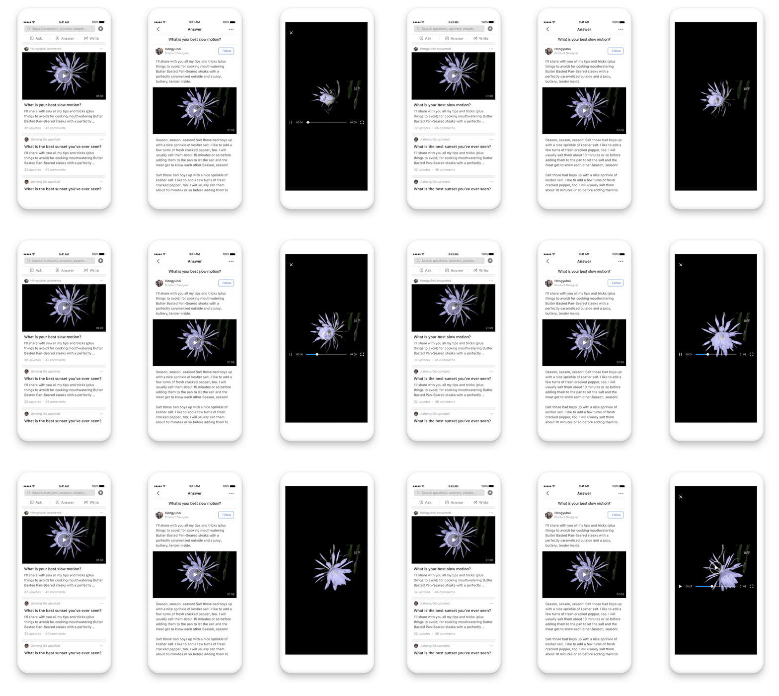
Part 2 • Video Uploading
How can we reduce the waiting time through design? What are some technical constraints that I had to balance?
Uploading Flow

Interaction Design
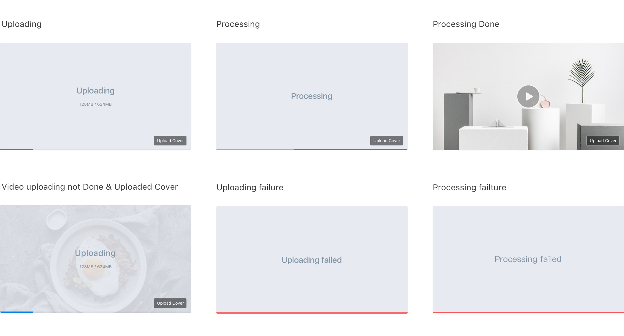
Video Uploading Experience
Web

App

Part 3 • Video Feature Onboarding
How do we make this new feature visible to the user? How do we encourage users to upload videos?
Why We Needed an Onboarding?
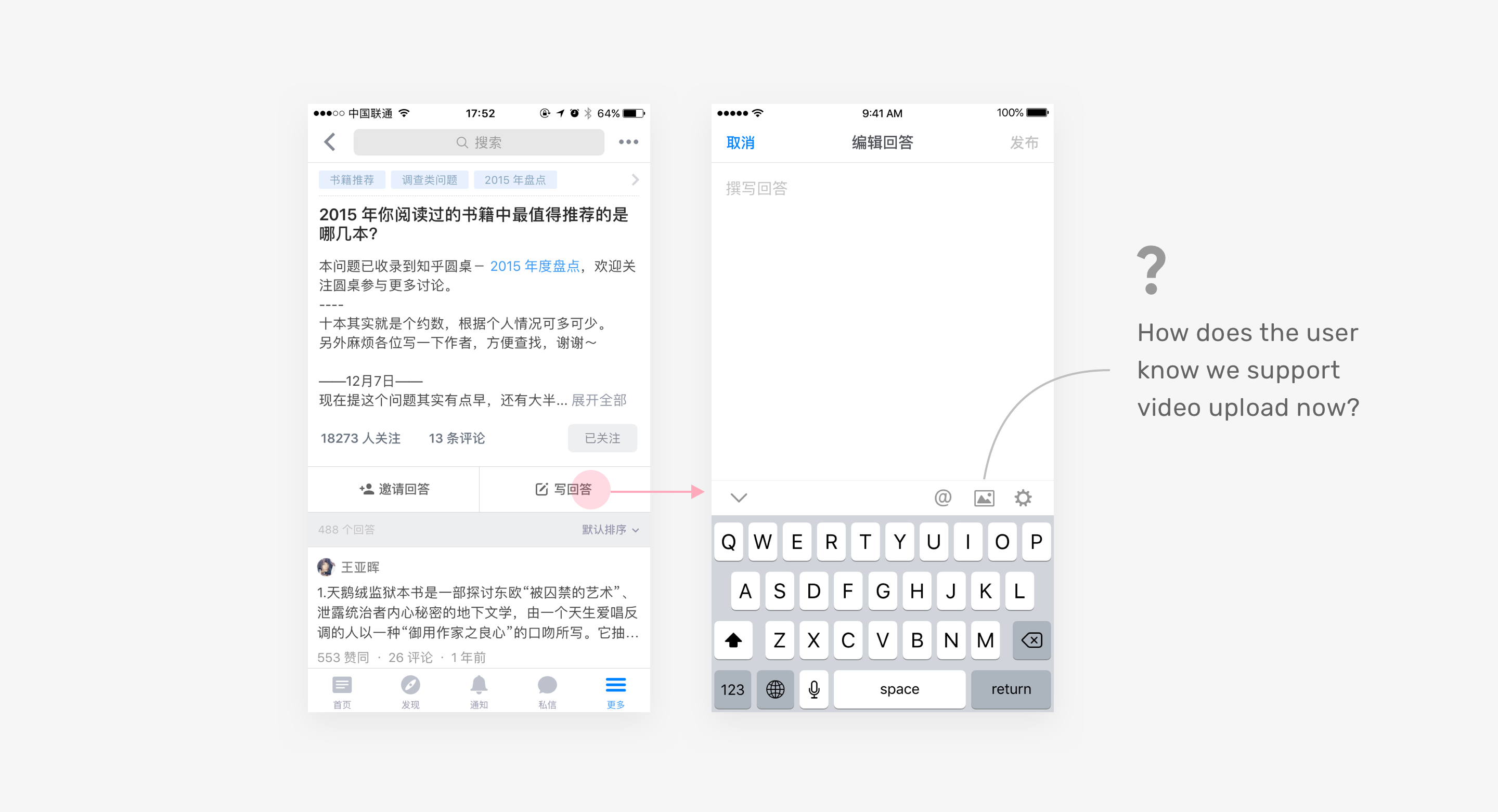
Explorations
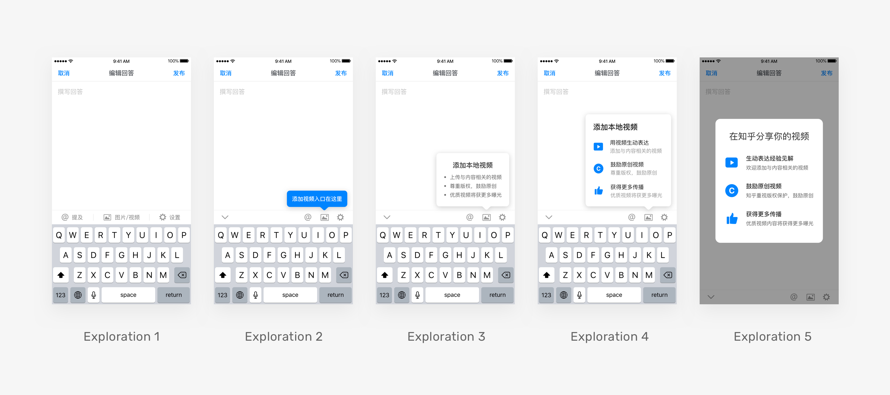
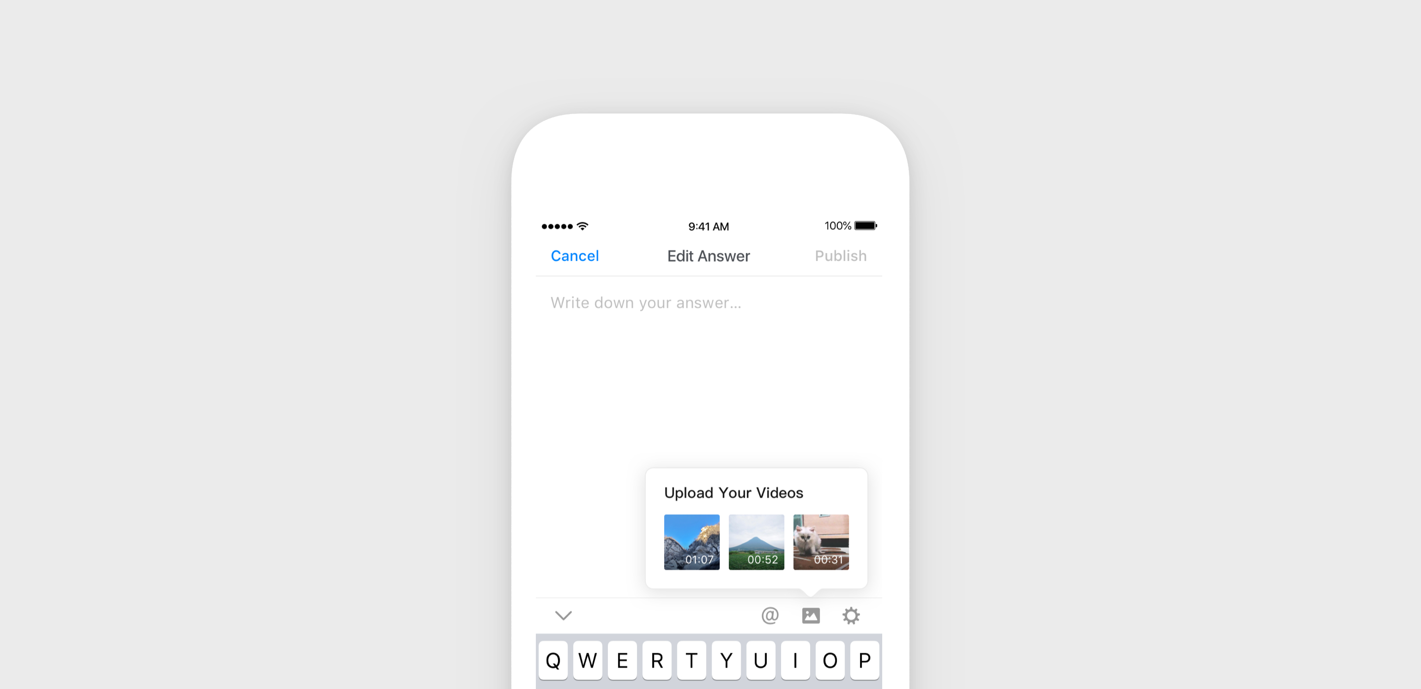
Onboarding Design
Impacts
- Established a new way of storytelling for over 200 million users on Zhihu as well as people from outside of the community. Numerous videos are created and watched each day, to help answer questions and inspire wonderful ideas.
- After launching the onboarding experience for app, the average weekly uploaded videos increased 35%, the average weekly new video uploaders increased 45%.
